


What is an infographic?
Infographics use visual communications to convey a message by incorporating it into the design.
By combining different elements, an infographic can effectively present data in a way that can lead to better understanding.
An infographic must be striking and engaging to get the viewer’s attention whilst using effective visual communication to provide them with memorable information.
Why use an infographic?
Compared to other academic assessments, infographics are an opportunity to be more liberal with the layout of your communication. They are less structured and formal compared to a report and more visually impactful than a poster.
Infographics require as much effort to prepare as a report and require condensing large amounts of information and refining the design to ensure they are visually impactful to non-specialist audiences.
Visual Flow
Infographics tell a story using data, aiming to provide simple information in an easily accessible format. Your reader should be able to follow the narrative of your infographic effortlessly.
The visual flow within your infographic is fundamental to realising your narrative journey. It should have a clear beginning, middle, and end. Ensure there is a natural progression and cohesion between your elements.
Visual Flow Examples
-
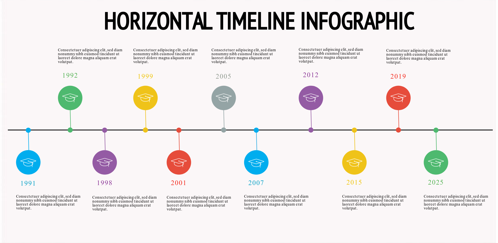
Timelines
These are uni-directional infographics that read from left to right or top to bottom.
Information is usually presented from a central line or an arrow at one edge.
Visual flow is relatively easy to achieve as there is a clear read order for the viewer to follow.
-
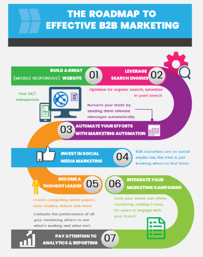
Journey or Roadmaps
These structures are similar to a timeline but involve a route that is rarely straight.
With these, visual flow is established by a road motif, lines or arrows, directing the reader to the next step in the process.
-
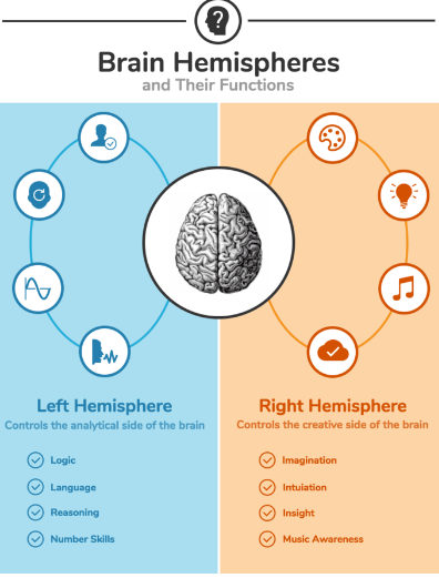
Comparison Structure
If your narrative requires you to compare two items, a symmetrical structure is ideal.
You can generate visual flow by using colours, repetitive forms, or header styles, or a combination of these.
-
Radical Structure
There are several ways to structure an infographic using a radial structure.
Visual flow generally travels around these graphics, usually in a clockwise direction.
It can be helpful to indicate the flow to the reader by using numbering, lettering or arrows.
-
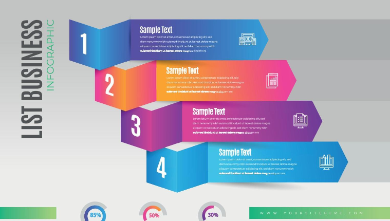
List Structure
Sometimes the basic structure of your infographic is a list of information (e.g., 10 top tips).
These usually work best in long-thin graphics (portrait orientation).
Visual flow is generally easy to achieve as it uses our natural reading order.
Developing an Infographic
Here are some steps to consider when developing an infographic.
Know Your Aim and Purpose
Know your overall goal and purpose of the infographic. Is the main purpose to inform, persuade or entertain?
Ensure you know your main message and focus on this, so that it is obvious to the reader. If you want them to change their actions (often a purpose of persuasive infographics) then this needs to be obvious, not just implicit.
Ensure Academic Rigor
Like any other assessment, the reason for producing the infographic is to illustrate your knowledge and understanding of your topic.
Use your reading lists, the library catalogue and electronic databases, to identify credible, academic and reliable information sources to include in your infographic.
Decide on Composition and Layout
Focus on the structure of your infographic. Consider your story and arguments then decide how best to structure them.
Use the most effective visual (graphics or charts) to clearly visualise your data. D
Whilst a successful infographic will show information in the most effective way, it will also have an appealing style. Experiment with elements such as colour, font and icons, but be sure to make it readable and consistent!
Tools for Creating Infographics
Here are some software programs or apps you can use to create infographics:
- Powerpoint
- Canva
- Piktochart
- Venngage
You can access information and develop your digital skills by accessing our Digital Literacy guide.