What are academic posters?

Academic posters are a dynamic way to present key ideas effectively and efficiently. The skill lies in conveying complex ideas with clarity. When developing a poster, you need to find and analyse information, structuring and presenting your argument in a direct and visual manner. Posters as assignments are used to:

Different Types of Poster

Posters are used for campaigns, at academic conferences,  in advertising and for public health. Posters are developed with an imagined audience in mind, and the presentation of the poster should reflect the audience's requirements.

Strategic Planning for Posters

The planning of your poster is fundamental to its success. You must reflect on what your poster is about, who your audience will be and why you are developing it.

Creating your poster

  • Who, What and Why

    A poster presentation assessment is an opportunity for you to demonstrate strong transferable skills such as:

    • Team-working and collaboration
    • Written, oral and visual communication
    • Project management

    A poster presentation allows you to summarise your project in a concise and aesthetically pleasing format. If you have been asked to create a poster for assessment, then the poster's purpose is to:

    • Demonstrate your ability to find, evaluate and interpret relevant information
    • Demonstrate your understanding of the topic and that you meet your learning outcomes
    • Present a structured argument
    • Develop and show your presentation skills

    Your audience will typically be your assessor and your peers will be the imagined audience. For example, if you were developing a health literacy poster, your imagined audience might be the patients or service users.

  • Planning your Poster

    Academic posters are a critical medium for communicating complex scientific data in a visually digestible format. They serve a pivotal role at scientific conferences, symposiums, and seminars, offering researchers a platform to showcase their work, share findings, and promote dialogue within the scientific community.

    An effective academic poster can engage the audience, encourage questions, and spark meaningful conversations, thereby leading to new collaborations and insights. However, making an academic poster that stands out is not an easy task. It requires the ability to simplify intricate data into a concise, visually appealing, and comprehensible format that can quickly grab the attention of the passersby.

    When creating a poster for assessment, academic rigour needs to be maintained. Evaluate your assignment brief, and pay attention to the instructional terms. The content of your poster will be dependent on what you are being tasked to do!

    You need to present a clear message, supported with a focused and consistent argument with a logical progression.

    • Identify the logical sections of your argument. Think of your poster as an illustrated version of your abstract and structure it accordingly. What is the essential information that needs to be included?
    • You might include a brief background including your theoretical framework, methods and main findings.
    • Ensure all references are reliable, credible and academic.
  • Layout and Composition

    Content

    Due to the limited amount of space, you will need to carefully control the amount of information you present, providing either a brief overview of your work or a deeper exploration of one particular aspect. It is easy to overestimate how much writing you can include on an academic poster, so try have a clear idea about exactly what it is you want to communicate to your audience. Try summarise the main point you want to communicate in a sentence or two.

    Posters allow you to communicate information visually rather than relying heavily on text. To avoid large blocks of text, consider what information can be more effectively or concisely communicated using images, charts, or diagrams. You can also save space by strategically using references or links to direct the reader to additional information that you cannot include on the poster.

    Structure

    Academic posters give you control over how your audience experiences your work. Consider where you want the audience’s focus to start and end, and the order you want them to move through different sections.

    Ask yourself:

    • How do I want the audience to navigate the poster? Should they read in columns, left to right, bottom to top, or jump between sections?
    • How can I guide their eye using visual cues like arrows, colored backgrounds, boxes, shapes, and headings?
    • How will I indicate entry and exit points with images, signal words, or different text sizes?

    Structuring your poster effectively not only enhances its visual appeal but also reinforces your message and improves audience comprehension. For instance, if you're illustrating the development of a theory or methodology, consider a 'building' approach where viewers start at the bottom and progress through layers. Conversely, for a non-linear journey, draw attention to the middle and allow exploration of various sections freely.

    However, ensure your chosen structure aligns with your message. A poster demonstrating a specific methodology may require a linear structure to avoid confusion. When deciding on your poster’s structure, consider if it complements or conflicts with your intended message

    Style

    The style of your poster should align with its purpose and topic. However, there are essential guidelines to ensure clarity and accessibility for all readers

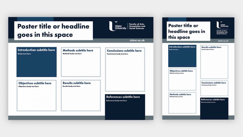
    • For a traditional poster use the rule of thirds to structure your poster into three columns and rows, placing crucial information near the central points.
    • Opt for vertical columns of text to aid readability.
    • Choose simple 'sans serif' fonts such as Calibri, Arial, Verdana, or Helvetica to prevent letters from blending and slowing reading pace.
    • Maintain a font size of at least 24 points for easy legibility, adjusting as needed based on presentation format (e.g., online or in-person).
    • Ensure contrasting colors for text and background to prevent readability issues.  If you are unsure about the use of contrasting colours, try using this free online contrast checker.

    Poster styles can vary and it can be hard to know what choices to make.

    Ask yourself should the style be:

    • Formal or informal?
    • Include complex language or simple? Use long sentences or short?
    • A personal reflection or detached evaluation?
    • Visual or text only?
    • Colourful, or neutral tones?

    To answer these questions you might want to refer back to the ‘audience profile’ and think about ways of navigating what they want/need to get from the poster and what you want/need to get from the poster.

    For example, if you have an expert audience who you anticipate would know a lot about your field it may be more appropriate to use some complex, subject-specific terminology.

    Or maybe your goal is to simplify a complicated phenomenon, in which case you might choose to create a more informal poster that uses lots of images and simple text.

    There’s no right answer to these questions and sometimes your wants and needs might clash with those of the audience. In these cases, the task is to try and find a way to negotiate between your own goals and those of the audience.

  • Best Practice

    Top Tips for Academic Posters:

    • A clear, large heading that you can read from several paces back in the room. Your audience should be able to read it without having to get really close.
    • It should be really clear where your viewer should look first and what order they should move through the rest of the poster. Generally a column format helps this.
    • Use a font size large enough that it can be read from a distance, and keep it consistent for headings and the main body of text.
    • All posters should include a combination of text and images (charts, diagrams, photographs etc.,). Images should be appropriate and relevant to the content.
    • Your findings and conclusions should be obvious and easy to find.
    • Don't overfill the poster with information. Less is more! Save space with bullet points and short sentences. Use images instead of words where possible. Think of it as a visual representation of your abstract not your whole paper.
    • Use colours that are interesting and appealing. Ulster have brand guidelines on the appropriate use of colours.
    • Make your poster look professional by using contrasting colours, white space and high resolution images. Use empty space to frame sections and make your poster look organised.
    • Break the information into bite-size sections. Chunking your material means people can understand it better.
    • Focus the message. If the audience were to remember one message, what would it be? Make sure that message is prominent.
    • Choose a brief and engaging title and use headings to present a clear structure.
    • Hook your reader from the start. Include an interesting fact, quote or statistic in the first section.
Further Resources

Further Resources

You can access information and develop your digital skills by accessing our Digital Literacy  guide.